Sunday, August 31, 2008

Algue från Vitra

Kul bild på Vitras alger eller 'Algue'. Enkel och kul lösning med små alg-liknande delar som byggs ihop till ett konstverk på väggen, rumsavdelare, gardin eller vad man nu kan hitta på.

Fun image of Vitras 'Algue'. Small pieces that built together can be art on the wall, room dividers or what ever you want.


Friday, August 29, 2008

Fotograf James Merrell

James Merrel är en fotograf med otrolig bredd och en extra studs i varje bild. Hittade massor av fantastiskt vackra bilder och härlig inspiration på hans sida. Se och njut.

Take a look at these images from photographer James Merrel. A great photographer with a large range of all kinds of wonderful images on his site. He really adds an extra twist in every picture. Enjoy.

Med lite orange udd...


...eller asiatisk känsla...


...eller maskulint brunt och grått.


Wednesday, August 27, 2008

ad.white

På tal om vitt så kommer Alcro med en kulörkollektion helt i vitt - ad.white. 11 olika vita kulörer: Snö, Äggskal, Krita, Lovika, Tofu, Vitlök, Grädde, Magnolia, Älva, Fjäder samt Vit. För dig som gillar att inreda i vitt. Framtagna i samarbete med designern Eva Lilja Löwenhielm. Bild från pressrelease.

Speaking of white, Alcro have got a new colour collection of 11 diffrent shades of white. In cooperation with the designer Eva Lilja Löwenhielm.

Tuesday, August 26, 2008

Vitt, vitt, vitt... igen

Ett ständigt återkommande tema, vita miljöer, här med lite mixad stil. Bilder av fotograf Jason Loucas, Lizard Management.

White rooms again, these with a mix of style. From photographer Jason Loucas, Lizard Management.


Helt underbar respons

Oj, vilken härlig respons det blev på Design & Inredningsbloggen som visade bilder från mitt hem. Måste bara återge några helt underbara kommentarer:

'galet snyggt' - Anness blogg
'mitt hus känns som ett dass i jämförelse' - Hemma på Landet
'nästan så att jag får andnöd här framför skärmen' - Annlouise
'jag är beredd att ta ett fängelsestraff bara jag får bo där' - Camillas nya hem
'om jag kommer med kudden under armen, får jag stanna ett par nätter då?' - Inredningsbloggen
'gillar allt' - Proforma
'nä, vad jobbigt snyggt' - Bara mitt lilla hem
'hur tror du att någon annan vill visa sitt hem nu' - Hemmariket
'här vill jag flytta in' - Hannas vardag
'man får ont i magen av att titta på bilderna' - Husmusen

Tack allihop, även alla ni andra med kommentarer som jag inte nämnt här, och tack Pethra! Ni är för goa allihop!!

Monday, August 25, 2008

Glamoröst med metall

En glamorös och tjusig stil med möbler i metall tillsammans med glansiga metalliknande tyger och färger. Det behöver inte alls bli hårt och kallt som man kanske skulle kunna tro utan här har man tvärtom lyckats skapa en ganska elegant och varmt avslappnad miljö. Mjukt är mixat med hårt och metalliska färger är gemensam nämnare. De första bilderna är från fotograf Polly Wreford och den sista från stylist Laurence Pasquier - från Sarah Kaye representation.

Glamouros and elegant with furniture in metal with matching metalic colurs. Hard is mixed with soft to get a warmer style. From photographer Polly Wreford and stylist Laurence Pasquier, Sarah Kaye representation.


Sunday, August 24, 2008

Entryways & Michael Smith's New Products

I'm excited to post that Michael Smith has new products out for his Jasper Line, which includes furniture and fabric. In addition, his new book, Michael S. Smith Houses is available October 21, 2008. I have a link below where you can go check it out or pre-order if you want.


Here is Michael's Deauville Fabric. It is so understated and beautiful. It reminds me of linens that I grew up with.

This is the Lyon Biblioteque. Wouldn't this be wonderful next to your favorite reading spot?

The Treviso Armchair or the Italian Gilt Dining Arm Chair. The website lists it under both names. This is classic styling at its best. I love the pattern on the back rest of the chair, the acanthus leaf detail and the gilting. For a closer look, go to his website http://www.michaelsmithinc.com/ and look under "tearsheets".


Medici Console Table. Perfect for an formal entryway with its Louis XVI styling and gilting.


Close-up of Medici Console.


What makes a good entryway? Should it be functional or fantastic? Should it be designed just for a great first impression or should that go by the wayside in lieu of a place to set your wet boots and hang up your coat?


I believe the function of your entryway depends on the style of your home and what your family needs are. Obviously, a family with children may need something a little more functional than a young New York couple who entertains a lot.


Below are some fantastic examples of entryways that I have found.


Designer Jennifer Nilsen for Designer's Challenge. I love the colors of this space. The robins egg blue and the lime green are so fresh and inviting. The table legs are fabulous as well in different colors. This looks like an artist's home.


Designer Erinn Valencich for Light It Up. The combination of this whimsical wallpaper, with the contemporary styling of the dark wood mirror, bench and side table work well together. The pillows pull in the subtle colors from the wallpaper. Nicely done.


To accessorize with pillows, there are a few tricks of the trade that may help you in your decorating. Pillows can be a unifying element in a room. These pillows can be square, round, or rectangular and average in size between 12 and 18 inches in diameter. Be careful not to add too many decorative pillows, however. Though the look is luxurious, it may overwhelm the space. One beautiful accent pillows is enough. Smaller than the other pillows on your bed, they are often made of more expensive fabrics and are sometimes embellished with beading, sequins or other trim. Choose your favorite shapes or go with boudoir pillows or neck roll styles.


Another design by Erinn Valencich for Light It Up. Love her styling. She has a knack with accessories. Here she keeps the accessories colorless so the beautiful wall color is highlighted.


Designer Jackie Glisson for Designer's Challenge. The ironwork in this space is the main attraction. The built-in cabinetry with the faux-painted stone walls give this space a very luxurious, rich feel.


Designer Kristin Hannah for Designer's Challenge. This hallway's beautiful Spanish tile and faux painting on the adobe walls gives this space a very welcoming feel. The large wood table and spanish styled wood mirror above it add to the warmth. Photo by Dino Tonn.


Designer Lori Dennis for Designer's Challenge. Open, light and airy. The wall-mounted cabinet give this entrance hallway a more open feel and the niche above it gives the room the illusion of having more space.


Designer Simon Temprell for Designers Challenge. The iron in this entryway is the main attraction. The cream and parchment walls offers a nice backdrop for the ironwork.


Interior Designer Victoria Hagan. She incorporates into this entryway a few of my favorite things... dark floors, white walls, and over-sized lantern fixtures. Simplicity is key here, but the bones of the space are good to start with. The parquet floor, the columns, the greek key motif ceiling border and the Swedish-styled x-frame armchair give this room it's classical styling.


This photo is from a Pottery Barn ad. But, what I like about it for an entryway is that it is stylish, comfortable and functional. The kids can come in from school, sit down, take their shoes off and store them in the bench cubby, throw their jacket up on a hook and they are off running. And Mom gets to keep the area stylish with the glass vases and all the natural elements of the space; including the reed grasses, the woven baskets, a starfish from the beach and to tie it all together, the map wallpaper.


Interior Designer Thomas Pheasant. Fabulous entryway with the marble-topped console table and urn atop. These chairs are what Barbara Barry uses often with her decor, with a greek key motif added. The mirror with the meandering twigs looks wonderful against the marble wall.


Interior Designer Thomas Pheasant. I love his subtle color use in this space. The long narrow bench is the perfect compliment to the wonderful art on the wall. Although, my favorite two things about these spaces are the wonderful birdcage light fixture and chest and mirror in the back space. I want them both!


What is so striking about this entranceway is of course, the sculpture piece on the table. But, it works because the area is simplified and not overdone, as so many people try to do in their designs. This space is cold with all the marble and iron and the organic sculpture was just what this area needed.

Saturday, August 23, 2008

Laura Fulmine

Stillebenliknande inspiration från stylist Laura Fulmine. Bilder från Sarah Kay Representation.

Still life kind of inspiration from stylist Laura Fulmine. Images from Sarah Kay Representation.


Friday, August 22, 2008

Enkelt och somrigt i Uruguay

Enkelt, somrigt, svalt men mysigt sommarhus i Uruguay. Svalt med betong och mysigt med textilier och kuddar. Lägg märke till att man med hjälp av madrasser med kuddar fått möjlighet att ändra från soffor till extrasängar vid behov. Från CôtéMaison.

Simple, cool but cosy style in this summarhouse in Uruguay. Notice the smart kind of sofas that easily can change into extra beds if needed. From CôtéMaison.


Wednesday, August 20, 2008

Scenes From A Beach House

Summer is nearing to an end and my children are getting ready to go back to school this week. (Well, they aren't exactly ready...). Since I've just blogged about items I would have in my dream beach house, I thought I would post pics of some inspiring beach houses. After seeing a few of these, I almost want to edit my dream home now!


Coastal Living magazine dining and living room. Very elegant with the formal fireplace, crystal chandelier and white china. The glass and candle decor on the mantle give the room additional sparkle.


Windmark Beach Club (Florida) porch setting. Very clean aesthetic with the fresh sky blue cushions, sisal rug and huge blown glass vases.


Beach home mermaid bedroom. I believe this pic is a rental home in Florida. I can't tell if the headboards are a wicker material or iron, but I think they are adorable for a beachy kids room. The headboards would probably show up better against a wall, rather than a window, and I'd paint that little nightstand a different color.


View of the Ocean from the Yellowstone Club in Turks and Caicos.


Windmark Beach Club patio swing. Lovely fabric selection. Doesn't this look comfortable? All you need is a tall glass of iced tea!
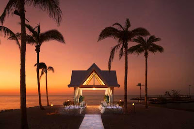


Tranquility Bay Resort in Key West, Florida. Perfect setting for an evening wedding.


Tranquility Bay Resort.


Tranquility Bay Resort. Dinner on the porch - spectacular!


Tamarindo Yellowstone Club, Costa Alegre, Mexico. I would love to see what is at the top of these steps!


Spa at the Tamarindo Yellowstone Club. How could you not relax in this setting?


Tamarindo Yellowstone Club.


I got this photo from a Southern Living web link. Look at these louvered doors. I don't know if this is a beach house, but anytime I see louvered doors like this, I think of either the South or the beach. I love how the home owners can shut the louvered doors if they want more intimacy during their dinner.


Living room from Southern Living magazine. Love the distressed beams and the natural cream colored draperies with ties. It ties in with the slipcovered furniture (pun intended!).


Slipcovered Dining Room. The dark hardwood floors really make the white slipcovered chairs pop. I like the splashes of red, but they were careful to not overdo it.


Point Click Home website. Fireside chat setting. Designer Candice Olsen did a patio like this for a client. This may have been it! The firepit is a little unconventional, but that's what I love about it.


Elle Decor white bedroom. I don't really like shabby chic that much, but the combination of louvered shutters and empty white distressed picture frames strewn with beads just puts me over the top for this room. Ingenious.


Sitting room from Elle Decor magazine. I like the mix of distressed iron with the gold picture frames, lamp and fabric in the room.


O.K., I love this dining room. The balance is perfect between the rattan chairs, the blue and white fabric on the end chairs and the black and white striped draperies and black lampshades on the breakfront. And, not to stand out, but to compliment the room, the area rug with the thinner black and light grey stripes. Perfect. I would definitely have this room in a beach house of mine! Well, at least until I got bored and wanted something a little less perfect!


Elle Decor bathroom from Point Click Home. How wonderful is that print of Mona Lisa over the tub? Pretty unconventional. The wood trim on the bathtub and step-up are beautiful. Add the slip-covered chair, candelabra and open doors to the deck, plus a glass of wine and you've got shangri-la!


Living Room from Cottage Living magazine. I like the slipcovered furniture and white furniture, walls, shelving, etc., but I almost want to draw in some more natural elements, such as some more baskets to go with the area rug, or a large palm back by the shelving to give this room a little bit more of an organic quality.


Four Seasons Hotel in Costa Rica. The wrought iron railing and the light fixture do it for me (and the view is not bad either!).


This picture is from Cooking Light magazine. This entry hall looks like a beach house, but I'm not sure. The dark paint on the stairs give it a nautical feel. Love it!


White bedroom from Coastal Living magazine. The periwinkle banded bottom on the drapery and the shells on the wall definitely make this room beachy.


"Vision in White" from Coastal living magazine. Strong orange accents give this room energy. I like the rattan rolling ottoman and the starfish and flower pot to match the pillows. Oh, and look at that fabulous lighting fixture!


Sunroom with a great daybed from Coastal Living magazine. I love how they pulled in more iron with the chandelier.


Dark wood kitchen open to the lush greenery outdoors. Very tropical.


From Coastal Living magazine. Color of the bookshelves and mirror is fantastic.


Living Room from Coastal Living magazine. The madras rug and paint color pull this room together. Note the beadboard on the ceiling and the wonderful octagon table.


Coastal Living magazine front entry. The light blue chairs and mirror really stand out against all the dark wood in the room. Note the blue and white pottery on the bottom shelf.


Carribbean living room from Coastal Living magazine. This room is my style. I love the balance and scale of everything in this room and am always in love with rooms that open up to patios or porches fully.


Living Room from Coastal Living magazine. Again, the dark wood really makes everything white in the room pop! Lovely.


China Beach Suite. A bit more modern than I like for a beach suite, but still wonderful.


China Beach suite living room view. Check out that cool ceiling lighting fixture, complemented by the standing light fixture.


Breakfast by the Sea. I just love the unironed slipcovers on these darkwood chairs and the chandelier. I may have done a different rug (perhaps some soft green and black thin stripes to bring in the colors of the displayed bottles), because it kind of gets lost in the decor. I always love glass displays, especially these large glass vessels on the table.


Let me know what you'd like in a beach house!